Friday, 27 May 2011
Rough Cut
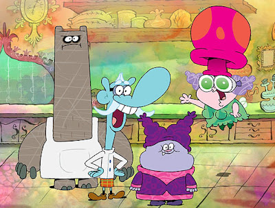
Here is the rough cut of my film which I will present for assessment. I'm a little disappointed that I didn't manage to get more finished before the deadline, but I know for certain I worked as hard as I possibly could and really gave it my all to try to bring Tizz and her story to life without compromising on quality. Hopefully it shows and I'll be able to finish everything to a respectable standard in time for the degree show in two weeks time.
Scene 27
Simple scene; I used the symbol of the bottle from scene 26 and added some squash and stretch to the cork to make it seem more like it was being squeezed in and was a tight fit. I intend to animate the sleeve a little so it's not so stiff for the final show, but at the moment I don't have time.
Scene 26
I admit this needs work, but it was the best I could do with time I had remaining. I converted the bottle into a symbol and animated the lightning inside it so the frames would repeat as the camera zoomed in. My first attempt has the lines of the lightning far too thick and consistent so it just looks horrible...
My second attempt is much better I think. I added more frames and went back the edit the previous ones, erasing parts of the lines to make them thinner, more jagged, and less uniform all round. I think this makes the lightning seem a lot more electric and alive than it was before, though if I get time I hope to improve it further later on.
Scene 24
Horrible, cheap tweening, I know. This was done purely as a last resort due to running out of time, I fully intend to go back and animate this properly for the degree show. I only did this to serve as a slightly more animated animatic shot to fill the gap in the rough cut of my film for when I present.
Scene 18
Lightning striking the kite scene. I purposefully made the outline of the kite rough and sketchy after the lightning strikes it to try and create a dramatic, slow motion effect, much like you often seen at moments with an intense power surge or explosion in anime:

Added the background, full screen flashes, and kite string.
Added the kite tail, again trying to keep the dramatic sketchy style, making it look slightly stiffer after being electrocuted.
Wednesday, 25 May 2011
Colour/Texture Tests
When I was visualising the overall style of my film, I thought I'd really like to try experimenting with textures along with painterly backgrounds to take the edge of the sharp, flat colours that are typical of Flash animation. My main inspiration for this was Cartoon Network's Chowder, which colours parts of clothes and scenery by having its characters moving over stationary textures, as you can see in the video clip below.
I think this is really nice effect that should theoretically be very simple to do using masks in Flash, so for now I've done a few quick tests to see how adding textures will look.
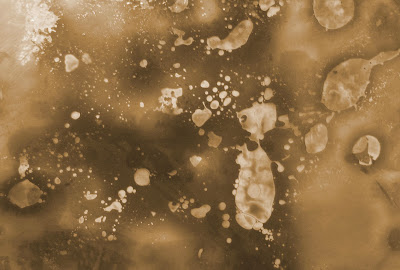
This is the texture I'm experimenting with, originally blue ink splats turned greyscale in Photoshop, then colorised with a yellow hue.
I then used the overlay blending option in Photoshop to make the texture appear as part of the colouring.

Here you can se how the effect works with the background in comparison to the flat colours. Personally I like it a lot, though I think it requires a little tweaking to avoid texture over-kill... At the moment the ink splat texture combined with the already painterly texture of the background feels a little overpowering. I'll have to experiment more after the deadline when I have time.

I think this is really nice effect that should theoretically be very simple to do using masks in Flash, so for now I've done a few quick tests to see how adding textures will look.

This is the texture I'm experimenting with, originally blue ink splats turned greyscale in Photoshop, then colorised with a yellow hue.

I then used the overlay blending option in Photoshop to make the texture appear as part of the colouring.


Here you can se how the effect works with the background in comparison to the flat colours. Personally I like it a lot, though I think it requires a little tweaking to avoid texture over-kill... At the moment the ink splat texture combined with the already painterly texture of the background feels a little overpowering. I'll have to experiment more after the deadline when I have time.
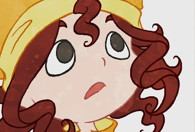
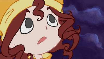
Scene 28
Started tracing key frames from the animatic.
Added more in-between movement, acting it out myself as I went along to get the arc of the back right as she straightens up and raises the bottle.
Finished the body movement and added the face. I spend a long time focusing on the facial expressions to get the absolutely perfect, as this is possibly the most important scene for her to show how truly in awe she is of the lightning and overjoyed by her success.
Added the coat, making sure to add an extra few frames for the follow-though movement of the sleeve whenever she stops.
Added the hat, again with a few extra frames for follow-through movement so it flops down rather than looking stiff.
As usual I tool a lot of care with the hair, especially at the end when it springs up with static. That was difficult to work out how to do, but I eventually discovered that exaggerating the hair so it stands up almost completely straight/on end before pinging back into the zig-zag locks was the most effective.
Fully coloured scene with background. This will be as final a version as I can accomplish before the deadline due to time constraints, but I'll go back and add the lightning/cork/lighting afterwards for the final show.
Subscribe to:
Posts (Atom)