Friday, 27 May 2011
Rough Cut
Here is the rough cut of my film which I will present for assessment. I'm a little disappointed that I didn't manage to get more finished before the deadline, but I know for certain I worked as hard as I possibly could and really gave it my all to try to bring Tizz and her story to life without compromising on quality. Hopefully it shows and I'll be able to finish everything to a respectable standard in time for the degree show in two weeks time.
Scene 27
Simple scene; I used the symbol of the bottle from scene 26 and added some squash and stretch to the cork to make it seem more like it was being squeezed in and was a tight fit. I intend to animate the sleeve a little so it's not so stiff for the final show, but at the moment I don't have time.
Scene 26
I admit this needs work, but it was the best I could do with time I had remaining. I converted the bottle into a symbol and animated the lightning inside it so the frames would repeat as the camera zoomed in. My first attempt has the lines of the lightning far too thick and consistent so it just looks horrible...
My second attempt is much better I think. I added more frames and went back the edit the previous ones, erasing parts of the lines to make them thinner, more jagged, and less uniform all round. I think this makes the lightning seem a lot more electric and alive than it was before, though if I get time I hope to improve it further later on.
Scene 24
Horrible, cheap tweening, I know. This was done purely as a last resort due to running out of time, I fully intend to go back and animate this properly for the degree show. I only did this to serve as a slightly more animated animatic shot to fill the gap in the rough cut of my film for when I present.
Scene 18
Lightning striking the kite scene. I purposefully made the outline of the kite rough and sketchy after the lightning strikes it to try and create a dramatic, slow motion effect, much like you often seen at moments with an intense power surge or explosion in anime:

Added the background, full screen flashes, and kite string.
Added the kite tail, again trying to keep the dramatic sketchy style, making it look slightly stiffer after being electrocuted.
Wednesday, 25 May 2011
Colour/Texture Tests
When I was visualising the overall style of my film, I thought I'd really like to try experimenting with textures along with painterly backgrounds to take the edge of the sharp, flat colours that are typical of Flash animation. My main inspiration for this was Cartoon Network's Chowder, which colours parts of clothes and scenery by having its characters moving over stationary textures, as you can see in the video clip below.
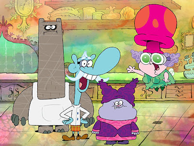
I think this is really nice effect that should theoretically be very simple to do using masks in Flash, so for now I've done a few quick tests to see how adding textures will look.

This is the texture I'm experimenting with, originally blue ink splats turned greyscale in Photoshop, then colorised with a yellow hue.
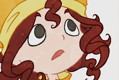
I then used the overlay blending option in Photoshop to make the texture appear as part of the colouring.

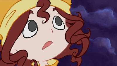
Here you can se how the effect works with the background in comparison to the flat colours. Personally I like it a lot, though I think it requires a little tweaking to avoid texture over-kill... At the moment the ink splat texture combined with the already painterly texture of the background feels a little overpowering. I'll have to experiment more after the deadline when I have time.

I think this is really nice effect that should theoretically be very simple to do using masks in Flash, so for now I've done a few quick tests to see how adding textures will look.

This is the texture I'm experimenting with, originally blue ink splats turned greyscale in Photoshop, then colorised with a yellow hue.

I then used the overlay blending option in Photoshop to make the texture appear as part of the colouring.


Here you can se how the effect works with the background in comparison to the flat colours. Personally I like it a lot, though I think it requires a little tweaking to avoid texture over-kill... At the moment the ink splat texture combined with the already painterly texture of the background feels a little overpowering. I'll have to experiment more after the deadline when I have time.
Scene 28
Started tracing key frames from the animatic.
Added more in-between movement, acting it out myself as I went along to get the arc of the back right as she straightens up and raises the bottle.
Finished the body movement and added the face. I spend a long time focusing on the facial expressions to get the absolutely perfect, as this is possibly the most important scene for her to show how truly in awe she is of the lightning and overjoyed by her success.
Added the coat, making sure to add an extra few frames for the follow-though movement of the sleeve whenever she stops.
Added the hat, again with a few extra frames for follow-through movement so it flops down rather than looking stiff.
As usual I tool a lot of care with the hair, especially at the end when it springs up with static. That was difficult to work out how to do, but I eventually discovered that exaggerating the hair so it stands up almost completely straight/on end before pinging back into the zig-zag locks was the most effective.
Fully coloured scene with background. This will be as final a version as I can accomplish before the deadline due to time constraints, but I'll go back and add the lightning/cork/lighting afterwards for the final show.
Scene 23
I turned Tizz into a symbol for this scene, allowing me to tween her movement off screen in order to make it smooth and correctly timed. I animated her hair and coat movement on separate layers inside the symbol so they would loop as she flew off screen. This saved a lot of time, trial and error.
Scene 21
This scene was especially tricky because I wanted it to be as smooth and fluid as possible, so I animated on ones rather than twos like I usually do. This meant a lot more work and I sadly didn't get the scene completed in time for the assessment, but I think it was worth is for the quality I achieved over all. The shot should look really effective once it's completed, which I intend to do for the degree show.
I started by tracing the keyframe from the animatic and tweening the falling towards the screen movement in order to get the correct timing.
I then worked on the facial expressions. I could have just kept her expression the same as she fell, but I really wanted to put in the extra effort to show her panic and fear as the lightning/ground closes in from above/below, so I took the time to properly animate a slight change in her face as she gasps for air, most likely crying out.
This time added the flapping coat tails. I animated each side separately to avoid them looking symmetrical and flapping in time with each other.
Rough cut shot complete with background.
Scene 20
Due to the previous shot being slow motion, I really wanted this scene to be fast and fluid in comparison to make up for it, as well as to hopefully exhilarate audience and raise tension due to the speed at which she's falling. I animated this scene on ones (24 fps) in order to achieve this, rather than twos (12fps) as I have done for all the other scenes.
I started with the coat/hat first (since you never actually seen the 'body' here), then animated the hair. Thanks to not having to worry about the body, the coat movement came surprisingly easily. I made sure to add a slight jerk at the end as she swings back with the string.
Next I animated the top half of the string to follow her down and she keeps tight hold.
Last was the key and the bottom half of the string, which was a lot more tricky. Getting the correct amount of flick from the key and the end of the string was difficult, especially considering the perspective and the necessity for the string to follow an arc motion. But I think in the end I got it looking right.
Finished animating the key and changed all the outline colours to match the rest of the scenes so there's be no confusion when it came to colouring.
Fully coloured scene with the background. I think the bright colours of her coat stand out especially well against the dark grass of this scene, and it's here that I think my decision to make the inside of her coat a paler yellow really paid off. It really helps differentiate the inside from the outside of her coat as she falls, making the rapid flowing movement easier for the eyes to read.
Scene 19
Slow motion falling/silhouette scene (with lightning flashing in the background, once the background for this section is finished). I started animating Tizz on the spot in mid-air for this in order to get the arc of her body right as she changes falling position.
I then animated the hair and clothes separately. None of the flapping is looped, I drew the hair, coat, and sleeves individually for every frame in an attempt to make the scene look interesting to watch despite not much happening.
Coloured silhouette with the string and key added. I fear the string might be a little too thick, but I feel it's necessary in order to make it readable...
Scene 17
Short but simple scene. Started animating just the face alone, making sure to as as much expressive detail as possible since it's such a close up shot. I took extra care with her eyes, making them widen and her pupil contract slightly as she looks up in order to show her shock/surprise. I could have exaggerated this more but I wanted to keep it subtle, after all the lightning hasn't struck the kite yet at this point, so it wouldn't make sense for her to have an over the top expression. This is more a 'breath catching in your throat in fearful anticipation' kind of glance. She knows the lightning is coming, and she looks up just in time to catch it.
Added the hat and the hair. Since the shot is so zoomed into her face, I purposefully over exaggerated the wind blowing her fringe in order to get more of it flicking into the frame in such a short period of time. I think this also serves to make the shot more dramatic and will hopefully help it make an impact despite being over so quickly.
Colour test for the scene.
Scene 16
Rather than just having a static hand reaching out before grabbing the string, I wanted to have the hand tremble and twitch slightly to really show how hard Tizz is reaching and struggling to grab it. While this will take a lot more time, I feel the scene will be too dull to watch without some secondary movement like this since it lasts several seconds. It's all part of the dramatic build up to the climax, so I need this scene to give a sense of desperation and determination like the others.
Started by key framing/animating the two extremes.
Added the yanking down/back movement as she finally managed to grab hold.
Exaggerated the hand grabbing and yanking down a little more.
Fully animated the string and added more twitches to the hand.
Finally animated the flapping of the sleeve int he wind.
Scene 14
I found this scene extremely difficult to figure out due to the odd perpective of the camera angle (chosen to make the shot more interesting and give the viewer some variety between scenes), so much so that I had to leave it and move onto other scenes before I finished simply because it was taking me so long. It took a lot of trail and error to get to it's current state, but I think it was worth it because now I have a good idea of how to go about finishing it convincingly when I get time rather than starting from scratch again (working from a blank canvas is always the most difficult).
Started just animating the head to get a sense of timing and distance for the fall.
Added the outstretched arm/hand, adding secondary animation to make the arm waver and tremble slightly to show the strain and effort she's putting into reaching.
Added the coat, though with no wind blowing it around yet. I'll add the secondary wind animation in last once I have all the other movements working right, as they're the most important. Billowing clothes should never be used to hide bad body acting.
I tried to add more pressure to the hand sliding down with her here, I wanted to make it look like she really grabbing onto the edge of the pylon for dear life to stop herself falling any further. Something' off about the way she looks up.back afterwards, though... I don't like it. I was trying to go for fear and worry for her personal safety, but she seems almost too afraid... I don't want it to seem like she's regretting her actions despite her situation.
I realised it didn't make much sense for her to glance back over her shoulder after she slips... What exactly is she looking at? The horizon? If anything it would be a lot more believable for her to to look back up at where she fell from, her eyes filled with frustrated determination as she tries to claw her way back up again. She may be afraid of falling, but she's Tizz, and Tizz isn't going to let a little setback like that stop her when she's so close to achieving her goal. It's vital I always keep her personality in mind as I animate, especially these scenes whether she's going through physical and emotional stress, otherwise I could fall into the trap of bad character acting which is the last thing I want to do.
Scene 13
Simple loop of Tizz's hair and coat billowing in the wind as she clings to the side of the pylon. I coloured her in silhouette because I envisioned the sky being lit up dramatically light lightning at this point and creating great contrast, but the current background is far too dark for this to work. I need to talk to Roshni about making the necessary adjustments in order for this scene to be effective.
Scene 12
Another scene where I felt facial expressions were especially important. This is the scene where Tizz faces a moment of doubt as she realises the scale of the obstacle she must overcomes in order to achieve her goal. It's here she needs to show her resolve to continue with her plan no matter what, despite the obvious impending danger, and the only way she has to do that is through her face. As usual I started animating the body first, splitting the scene into three sections: the initial jump, the lok back, and the turn to face the pylon again.
It was here I realised that the original three keyframes I had planned from the animatic wouldn't be enough to properly convey her resolve, she needs to look up at the pylon again after staring at the bottle to show the viewers exactly what she's intending to do.
Even after adding in the extra action of looking up at the pylon again at the end, I found that it still wasn't quite enough... The scene lasts too long for her to simply stare statically at the bottle in her hands for several seconds, it looks stiff and unconvincing. So in order to properly show her inner conflict and frustration with the thought of missing her chance to capture lightning, I've added in her raising the bottle to her face slightly with her eyes twitching angrily (inspired by my housemate Lucy!). I also added a little secondary animation to her hands and the bottle, making them shake slightly to show how tightly she's clutching it as though she's mentally telling the lightning there's not way she's letting it escape. While this took a lot of extra time I didn't have to spare, I really feel it was worth it as she looks so much more alive now... It really is like she has a mind and soul of her own (at least to me), and it's a joy to watch her.
Started adding some coat animation, though unfortunately I won't get time to finish it due to spending the extra time on her expressions... but if the two, I feel the expressions where more important in terms of character acting and getting the audience to empathise with her.
Added the lightning into the background so she has a reason for jumping and looking back. The lightning references from my earlier post were a great help here.
Background added.
Scene 9
This was a tricky scene to get right as I needed a smooth transition from standing to bending over to pick up the bottle to running. To accomplish this I used video reference of myself acting out the scene, though I didn't trace or rotoscope it. I only imported the video into Flash and stuck it behind the scene to save time keep flicking between two programs.
As usual started with the body, this time focusing on making the transition going into the run as smooth as possible before working on the rest beforehand.
Once happy with the body I added the coat, hat and boots. I realised I needed to make the wind suddenly change direction and blow her back slightly to justify why her coat/hair trails behind her as she runs rather that blowing in front her her, so I added in the secondary animation to supply this. I'm actually quite glad I did despite the extra time it took, as the scene feels a lot more interesting and dynamic to watch now.
Lastly I added the hair and coloured a few frames as examples for the second years helping me colour for the their Professional Practice module. I also added in her shorts for the few frames you can see them under her coat as the coat's blowing in the wind.
Scene 8
This scene was difficult not because of the animation itself but rather than many different elements in it that needed to work together at the same time. I can see why animated TV series often have so many production errors at the time of broadcasting, it's surprisingly easy to forgot something when you have so much to worry about at once.
I started with the kite since that's the main focus of the scene, ensuring it appears to get larger as it fills the screen before disappearing.
I then started on the hair, making it into a symbol layer so the frames would loop throughout the scene without me having to copy/paste them several times. I did the same for the coat and hat.
Next I started animating the string and key, which proved to be trickier than I expected... I found it difficult to get the string to follow the correct arc while appearing to get closer to the screen, so that took a fair bit of trail and error to get right.
Once I was satisfied with the string movement I animated the key, making sure it flicks out properly as the end of the string moves. Finally I added the kite tail, which follows the same dynamics as the string but was a lot easier to get right due to it being shorter and visible for fewer frames.
Scene 7
Due to this scene being a mostly static shot (in terms of character animation), I spent a lot of time animating the hair in order to make sure it flows as smoothly as possible in the breeze so the audience will have something to focus on while Tizz is just staring at the sky. To be honest I probably spend too much time animating the hair... but I think it really paid off as it looks like it's flapping gently rather than blowing wildly like in the other scenes, which took a lot more care, attention, and frames. The coat was easy in comparison.
Next came the body jerk as she's overwhelmed by a sudden gust of wind (the one about the blow the kite away). Again had to act this out myself several times to get the feel of it, including pulling numerous slow motion facial expressions int he mirror which must have made me ook quite demented. I think what I've done works, but it looks like it stops a little abruptly with the hair and coat blowing rapidly int he wind to compliment it... Though I'm fairly certain from all the times I've acted it out that it she doesn't require any further bodily animation, so I'll just have to trust my instincts and wait until I have time to add the rest of the hair to see the shot fully working.
Scene 6
I started simply tweening the pan of the background to get the timing of the sot right with the music.
I decided to add a slight bounce in time with the music to the end of the camera pan to make it seem as though it's being filmed with a hand-help camera, or perhaps even through the eyes of the viewer (as when you suddenly throw your head back, there's always a slight recoil). I think this makes the scene feel lot more genuine and less stiff. I also tweened he basic kite movement, again to work out the timing and exact path I wanted it to take in the sky before animating properly.
The animated kite. I exaggerated the curve on it as it's blowing upwards to give a sense of perspective, as well as the power behind the surge of wind carrying it.
Next I animated the body trowing the kite upwards, then the clothes and hat blowing around it.
Added the hair, string and the kite tail whilst on the ground. FOr the string I purposefully made the parts that connect to the kite waver slightly to try to give a sense of depth (I want the string to seem like it's beneath the kite from that angle) and to make it seem as thought he wind's affecting it separately.
Last but not least, the kite tail. I found animating the tail and the string a lot more difficult that I thought it would, as i had to ensure they each flowed from side to side with different rhythms and timings sue to their different lengths and heights in the sky. I soon learnt that while they move similarly, they both obey two very different laws of physics.
Scene 4
Despite seeming like a relatively simple scene, this shot proved to be a complete and utter pain in the backside, mostly due to the issues of timing and camera movement. I had to listen to Stefan's score constantly while animating to ensure that I timed the sudden camera movement up to her eyes perfectly with the dramatic change in music. This proved to be a challenge but also a great learning experience for syncing and working with sound in general.
For the counting lip movements I imported the video reference of me counting and rotoscoped the lips, then went back and made adjustments to the shapes, exaggerating the moth in order to fit with my far more cartoony character.
I then adjusted the positions of the lips for each frame to match up with the bobbing up and down of the head.
Added hair and eye movement to show the change in the tilt of the head as it moves up and down.
Scales everything up to the correct zoomed in position on screen to match the storyboard.
Animated the surprised blink of the eyes and the camera shoots up to focus on them.
Animated the smiling change of expression as a symbol, allowing me to easily tween the camera pulling out at the same time.
Finally added the arms, string, and key, making sure to animate the key slightly as she tightens the string around it.
Scene 2
This short scene wasn't too difficult to do, though a little more time consuming than I initially though due to the extra care and attention I gave to her facial expressions due to this being a very close up shot. I also did't want the hair to seems stiff and lifeless, so I made it bounce as she looks back to exaggerate the sharpness of the movement. Personally I'm pleased wit the outcome, I love how something as simple as a little secondary animation to the hair can bring a whole new depth to a shot. It really shows that a little extra effort can go a long way.
The scene fully coloured.
Fully coloured with background. All the backgrounds for my animation are courtesy of my awesome background artist Roshni Kakad, a second year from my course who is helping me as part of her Professional Practice module. I sent her all of my research concerning environmental concept and we had a lengthy discussion about my ideas and exactly what I wanted to achieve with the visual style, and I'm pleased to say she's responded exceptionally well. Her lovely painterly style is exactly what I wanted to take the edge of the hard colours and outlines of Flash, making the entire animation look a lot more aesthetically pleasing I think. Having her work on the background will save me a lot of time I can use for animating, which is naturally the area I most want to focus on, and I also really love her use of colour.
Scene 1
Easily the longest and most painful scene in the entire film, this opening shot took me about a month to animate fully. Ridiculous, I know, but the amount of time and effort I spend on all te little details in this shot will hopefully make it all worthwhile. I really wanted to give it my all as this is the opening sequence; so it not only serves as an introduction to the plot but also to Tizz as a character as well. I want her to capture the hearts of the audience from the moment her face appears on screen, so I spend days working on her facial expressions alone. Looking back there were plenty of opportunities where I could have gotten away with just holding one facial expresion for a few seconds (she's only staring at a bottle, after all) to save myself time, but I wanted to breath as much heart and soul into her as physically possible. Such a close up shot demands attention to detail, I has to ensure her face never distorts, that her eyes track the bottle as she moves around it, that her hair always falls and curls correctly around her face and on the ground, that her body movements are convincingly realistic despite being confined to such a small screen... These are all things I thought about constantly.
One of the main challenges I face was when she moves around to the opposite side of the bottle. This seems simple in theory, but in practice it was actually quite difficult to pull off due to the proportions of my character. While it's perfectly plausible for her to be able to do what I envisioned with her design, it isn't possible for a normal human (at least not an inflexible one such as myself) to physically crouch and move in such manner. And since I can only understand such movements well enough to animate them convincingly by acting them out myself... you can see my problem. Thank full I managed to get through it thanks to a mixture of trail and error and sheer perseverance on the acting front, and I'm pleased with the result. I wanted her to seem curious and cat-like as she moved around the bottle, which I think she pulls off quite well. This scene really showcases her quirky and inquisitive nature.
Started by tweening the bottle into the shot to get the timing of the 'camera' pulling out.
I used the frames from my run cycle for the feet running in the background to save a bit of time. I then started animating the body and face first without any clothes or hair to ensure I got the actions and expressions perfect. I believe facial expressions and body language are the two most important aspects of character acting, hair and clothes are nice but secondary in comparison.
I think animating the body first was extremely beneficial when it came to animating the clothes, as I could easily see were the coat sleeves should fall without having the guess where the arms were inside and such. This made drawing realistic clothing folds much similar and in turn helps my my animation that bit more believable.
Here I decided to try giving her a cheekily determined expression wit her eyebrows furrowed as she pushes herself up, but I soon decided I didn't like this idea... At this stage she hasn't fully formulated the capturing lightning plan, she's still very much in the moment of discovery and I don't want her to lose the look of sweet awe and innocence just yet. I think if I did it would detract from scene 4 when we see her smile deviously after the lightning first strikes, that should be the moment the audience first realises she has something big in mind and is not just your ordinary everyday little girl.
The hair was especially tricky for two reasons. One, curly hair is hard. I thought my character's long straight hair from SS1 was difficult to animate, but it was nothing in comparison even though Tizz's hair is much shorter. The curls make everything complicated, especially in terms of weight, thickness, and how the curls should rub along side each other. I want her hair to seem like is has a good body to it, it needs to appear thick and fluffy with decent weight. I tried to present this by always drawing the locks full and round rather than having lots of thin little strands flying away on their own.
Here's the final scene in colour.
Friday, 20 May 2011
Run Cycle
Since she'll be running downhill I didn't want this to be be an ordinary upright run cycle, she needs to look panicked and desperate and like she running all out, perhaps even struggling to keep her balance a little from the speed of running downhill. With that in mind I adapted a basic run example from the Animators Survival Kit to fit Tizz's needs, only making her center of gravity a little lower than usual so she looks like she's running closer to the ground. This will also compensate for the lack of arms to balance her, as she'll be clutching the bottle in both hands. I tried to make it look as though her head and shoulders/upper body are swinging left and right as she runs to supplement this as well.
I also took the time the make her mouth open and close a little so it appears she's gasping for breath as the cycle loops.
I also took the time the make her mouth open and close a little so it appears she's gasping for breath as the cycle loops.
Subscribe to:
Comments (Atom)