Sunday 30 January 2011

Tizz Is Born!


Some more experimentations before I settled on my final design. I started off trying out the idea of a hood rather than a hat to try hiding more of her hair, but I didn't like it... She looks too much like Little Red Riding Hood which was not my intention. I also tried playing around with different styles of curly-ish hair for hair, but I soon realised that making it only a little curly resulted in her looking too pretty and quaint, aloms Disney-esque... While I have nothing against Disney, I don't want my character to look like any typically sweet little girl who would be content sitting at home playing with her dolls and tea set. I need her to look a little eccentric, like someone who strives to live life beyond the ordinary that's expected of her while still looking naive and childish enough to not fully understand (or care about) the dangers her escapades could be putting her in. That's why I think the zanier, zig-zaggy hair of the bottom design works better, but at the same time is a little too far in the opposite direction... That's more how I'd imagine her hair after it's poofed out with static. I need a compromise between the two...


Here are my final character designs; in the end I went for hair closer to the zig-zag hair but slightly less intense. I've also decided to ditch the scarf idea as it seems unnecessary; just because she's out on a wet and windy day doesn't mean it's cold enough to need a scarf as well. Plus I need to be practical; I already have her hair, coat, and hat to animate blowing in the wind, I don't need a scarf to worry about as well. It would most likely just get lost amidst the chaos anyway. Naturally if I wanted to be really cheap I could give her skin-tight clothing and tuck all her hair under the hat, but honestly I think that would severely detract from her character, not to mention look horrible. She's the type of girl who doesn't really care about her personal appearance, if she happens to get wet of covered in mud or her hair gets tangled and knotted from her adventures, why should she care? As long as she has fun and achieves her goal, that's all that matters! So giving her fitted, fashionable clothes would make no sense.


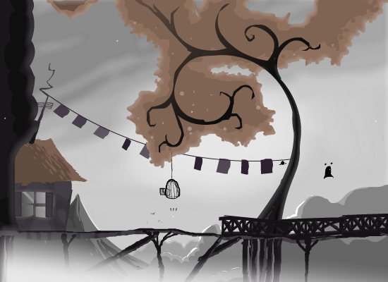
A couple of concepts for her hanging off the side of a building or pylon perhaps. Not especially something I had in mind for the actual storyboard, I just wanted to play with drawing her in different poses that came to mind in order to help my flow of ideas.


Another concept, this time of her falling/sliding down the kite string which I do intend to include in my storyboard. Under her coat she's bee wearing a top (which you'll never see), shorts (which you'll only see briefly in below shots like this), and tights to cover her legs.

While I think on, my tutor Sarra asked me some questions about how well I know my character, so I think I'll post the answers here in case anyone's interested in her background information. I've spent so long developing her that it seems a shame no one will know all this, but hopefully the effort will show in how well her personality shines through in the film.

First and foremost, my character's name is Tizz! Tizz is short for Elizabeth, and the name was inspired by a little girl who lives across the road from me at home in Lancashire. During my last visit our street had a street party and I saw her for the first time in years; she'd grown quite a bit from the toddler I remembered and is now 8-9 years old, around the age my character is. When I saw her running around I could hardly believe it--she had curly dark brown hair, big brown eyes and looked absolutely adorable. It was as though she was the live-action counterpart of my character despite her having no connection to me previously whatsoever. Her nickname sealed it for me though; Tizz isn't only short and cute, but also sounds quirky and (not wanting to make a terrible pun, but) electric enough to really fir with my story's lightning theme. And thus I decided to adopt the name! I hope she doesn't mind... But I think it really fits.

Tizz (my character) is an only child, no doubt loved by her parents but most likely left to her own devices a lot due to them both being busy with work, hence how she manages to get away with so many risky adventures. She lives in the countryside, is a bit of a tomboy by nature, and loves comics and fictional books. Her greatest virtue is probably her sheer determination, refusing to let anything get her down or stand in her way no matter how hopeless the situation. That's not to say she's fearless, she simply manages to overcome her fear by believing everything will work out in the end like in all her favourite stories, and has (fortunately) yet to be proven wrong. With every successful endeavour her confidence grows, leading to the point where she's willing to believe she can catch lightning in a bottle. She gets the idea after finding an empty bottle labelled 'Lightning in a Bottle' on the ground, and upon seeing a thunderstorm approaching above decides to try catching some lightning herself. If some other kid can do it, why can't she? Maybe she wants to experiment with it, or maybe she hopes that the lightning will give her superpowers. Maybe it's just the excitement of trying to catch something so wild and dangerous and supposedly unobtainable and she thrives off the challenge. Whatever the exact reason, she's naive yet brave enough to try.

Thursday 27 January 2011

Character Research


Knowing I want my character to be an adventurous, cheeky, and slightly insane young girl, I set to looking for examples of good character designs that share these traits from existed animated films to use as reference. The first of such that caught my interest was a character sheet of an early version of Penny from Disney's Bolt, as I really like the poses showing the different sides of her personality that we never really saw in the film. In particular I love the drawing of her on her hands and knees trying to study/pick something off the ground. It strikes me as very cat-like, almost as if she's waiting to pounce on her prey, and reminds me a lot of the times I used to play 'let's pretend' with my brothers as small children (we used to pretend we were lions and other big cats... You can blame the Lion King for that). I think it's a really lovely little nuance that I could add an extra dimension of depth to my character, especially since I really want to convey curiosity when she first finds the bottle.


Above is a character sheet for a character based on Gretel from the Hansel and Gretel fairy tail, seemingly done as a Disney training exercise since no actual animation has been produced around this story by them. What really struck me about tis design was the eyes, I love how wide and expressive they are without being boringly round... They're more like an over-exaggerated almond shape, reminding me somewhat of cat eyes... I also really like how well they work with the wide smile and squashed lower half of the face, though her body is too chubby for my tastes.


Next we have Coraline, perhaps my most prominent source of inspiration. As I mentioned in my earlier environmental concept post, I was strongly considering having my character's main colour as either yellow or orange in order to contrast and compliment the blue/purple sky, and it was this that reminded me of Coraline's yellow plastic raincoat she wears early in the film. Raincoats such as this are common apparel for young children playing outside in wet and windy seasons and easily recognised as a sign of youth and innocence (I certainly haven't worn anything so plasticy and brightly coloured since I was about 12), and considering my character will be outside in a storm, I think it's a good, practical outfit choice that can be easily related to, both by kids that still wear similar water-proofs and adults who either remember their own rain macs from their childhoods or dress their kids up in a similar fashion. Wellingtons are also an obvious choice to compliment the coat, though I may make them a different colour depending on how I colour everything else...


While searching for images of Coraline in her raincoat, I happened upon several very interesting concept illustrations of one of her earlier designs by Shane Prigmore. What struck me about these drawings is how they show a very different side to the Coraline shown to us in the film. Film Coraline is very moody and pessimistic, typical traits of a youngster having been uprooted from their homes and dumped in a new place they have no desire to be. The Coraline in these sketches, however, is clearly a very different girl. She's cheeky, playful, adventurous, inquisitive; always smiling and never letting anything get her down or stand in between her and discovering something new. Admittedly film Coraline becomes more like this as the movie progresses, but due to her story's dark and creepy nature, any innocence is soon lost and never really gets chance to shine with pure childish awe and excitement like she does in these drawings. It's the Coraline from these early concepts that feels like how I want my character to be, so hopefully I'll be able to draw from these expressions and poses to really give my character a soul of her own.


Another illustration by Pascal Campion, also showing a young girl in the iconic yellow raincoat and wellies. This girl, however, has brown her which I think works well with (and contrasts nicely against) the yellow. I think this brown hair would work much better than the blonde hair I was originally thinking, as I don't want the hair to blend in with the coat.


Ellie from Pixar's UP was another great source of inspiration, as she's the perfect example of quirky personified. She's a little girl who's let her imagination run away with her, and she's completely happy with that! Everyday is a new adventure, and she makes those adventures herself by always finding something new to explore. This si how I want my character to be: cheerful, fun-loving, determined to live everyday to te fullest... and just crazy enough that anything seems possible. I also absolutely love he scene where Ellie takes off her helmet and her hair poofs up with the static, it's an adorably funny scene that I can see working perfectly in context with the lightning in my story. Lightning is static electricity after all, so it would make sense for my character's hair to poof out if she gets shocked or actually succeeds in catching some.


I looked to the Scott Pilgrim comic books for ideas on how to draw my character's face in profile, as I always have trouble drawing noses and chins in profile exactly right... I didn't want them to be overly defined as kids have much rounder, undeveloped faces compared to adults, but at the same time I didn't want there to be no definition at all as that woud make her silhouette harder to read.


Lastly, going back to the cat influence idea, I spotted this character from the anime Yumekui Merry while searching for images through an anime blog. While I don't want my character to look anime style if I can help it, I really like the hat this girl is wearing... The two prongs remind me of cat ears and look really cute, as well as giving her head and interesting and defined shape. I also like how one 'ear' is almost always sticking up while the other is down... it gives a nice sense of balance and almost helps convey how she's feeling, much like how ears are often animated to show the emotions of animals. Another thing this made me consider is that if I'm going to be using a kite in my story, there needs to be wind to make it fly... Wind means my character's hair and clothes will have the be moving almost constantly, resulting in a lot of extra work and secondary animation. While I think it'll be worth it in the end if I can pull it off (it's unavoidable really unless I cut out the kite altogether, which I don't want to do), I could make things a lot easier for myself by giving my character a hat to prevent her hair blowing around as much as it would without one.

Environmental Concept

While the focus of my specialism isn't on background art, I feel it's important to carefully consider the environment surrounding my character in order to convey the correct mood and overall tone. In order to keep things as simple as possible, I've opted for everything to take place on a hill in the countryside somewhere, free from buildings, cities, other people, and even trees (other than the one I intend to have her climb in order to retrieve the kite). The sparse surroundings means that I won't have to worry about background animation other than the kite and the lightning, and the lack of clutter will allow the audience's attention to be drawn to the sky which needs to be the main point of focus as it's the sky that will convey the storm, as well as where the lightning will come from. I may or may not have storm sound effects at this point, but if for some reason I don't I need to ensure the stormy nature is apparent even without them.

Another aspect I feel is important is the style in which the backgrounds are painted. I intend for them to be digital, but I'm definitely not creating them inFlash... Flash animations are renowned and instantly recognised for their flat, vectorised style, and are sadly often associated with short cuts and bad animation. I'm going to take as few short cuts as possible with my final film as I really want my character to come alive, so the last thing I want is for the backgrounds to scream "Flash!" at anyone who's watching. Considering my style of animating consists of very neat line work, I'll most likely colour my character with flat colours in Flash, so I'd ideally like the backgrounds to be softer and more painterly to balance that out. Below are a few examples of what I'm thinking:


This is a screenshot from the anime Kimi Ni Todoke, which has uses lovely watercolour style backgrounds to give it's episodes a soft, delicate feel which blend perfectly with the show's emotional storyline. Usually the backgrounds are very detailed and far to elaborate to make a good reference for my film (which will be very simplified), but the above shot is from a moment of 'deformed' humour where everything was given the brief appearance of paper cut-outs. I really like the aesthetic and think if could be a nice possibility for my own backgrounds, depending on how things go.


These sceenshots are from a Flash game called Coma and serve as a perfect example of a Flash-made animation that used Photoshop painted backgrounds to give an eerie, serene, and painterly atmosphere. I love the details/shadows added to the grass and trees despite the relatively flat colouring, it all gives the world the characters populate a lot more depth and variety.


This is a piece of concept art I painted digitally on Photoshop to use as a background on my personal website. While I painted the character with myself in mind (hence the hair), I was very much thinking about my Lightning In A Bottle project and ending up using this as a test piece for environmental concept, which is why I've included it here. Despite the stormy skies I really don't want the sky to be grey... The last thing I want is for the girl's world to to seem dull, lifeless and desolate. The background and lightning in general needs to be dark but vivid, I want interesting colours to be used to portray the storm clouds like blues and purples, that way I can make the lightning interesting colours as well like the blue and purple lightning shown in the photos below. I feel this is important because I want the world to be shown as though through the eyes of my character; through the eyes of a child. Children always see the world as a brighter, more interesting place than jaded adults. Their imaginations transform the most mundane surroundings into fantastic playgrounds bursting with colour and magic, everything always seems better when you're young because if the endless possibilites and unexplored potential. That's what I want to convey using the colours of the sky.


Another things I realised while working on my background art was that if I was going to have a blue/purple sky, I would need my character to be coloured in a way that would stand out without clashing horribly. It's essential she doesn't blend into the background, so I'll need to avoid blues and purples for her outfit. Yellows and oranges contrast nicely against the cold sky colours as well as being complimentary (as I discovered with my blonde her in the background concept), so they seem like good starting choices to play with.

Saturday 22 January 2011

Very Rough Character Ideas

These are a few of my initial idea sketches for characters before I settled on the Lightning In A Bottle story... As you can see, they're not very good. Due to struggling to find the perfect narrative, I was also finding it difficult to find the right focus for my character, which led to me just scribbling down and playing with any idea that came to mid, no matter how vague or ill-formed.


Going back to the basics, I started by thinking primarily of eye and body shape, as I feel those are two of the most important aspects to character design. Eye shape is especially important to me as eyes are the windows to the soul, and if I want to breath life into my character, it's essential I draw her with the perfect eyes so the audience can connect to her through them. Face shape is also important to consider, but I often find that once I get the eyes right the face follows naturally afterwards. I know I want my character to have large, expressive eyes so I convey maximum emotion through them with ease, but if possible I'd like to stray away from the standard circular/oval eyes I usually do... In order to develop my skills as a character designer I need to push myself to experiment in order to ensure I don't wind up drawing all my character looking the same. I'm sure there must be a way to draw large, round, cute eyes without them looking identical to all my previous characters, which is why I've been testing out squashed ovals and tear-shapes.

Body proportions are something I need to be especially careful about, as I learnt the hard way from Specialist Study 1 that the big head/tiny body proportions I usually use have severe limitations when it comes to movement and the readability of poses. My character from SS1 achieved my goal of being cute and comedic, but due to her tiny body size and her very short arms, I found it difficult to convincingly exaggerate her actions as she was fighting her hair without being too cartoony, and as a result if I was to play her entire animation in silhouette, as lot of her poses would be impossible to read as everything overlaps into one shape. Since I intend for this film to have much more varied movement and action, I need a character with more elongated body proportions, longer arms, and most importantly, actual hands. She needs hands with digits that can articulate.


These particular experiments I'm not keen on, as I think I went a little overboard trying to elongate the body proportions, making her too tall. She now appears much older than I intended, possibly more like a teenager... I still need by character to look small and young enough for the lightning in a bottle story to be believable. Plus those face sketches looks horrendous, far too alien and not cute at all. I like the idea of her cheek sticking out slightly from her far eye in 3/4 view though... I think it gives he face a nicely defined shape with a little more depth.


These sketches are a bit of a throwback to my SS1 character designs I think... Far too melancholy and emo looking for the bright adventurous girl I now have in mind. Drawing her with straight hair has also made me realise that she looks far too plain and typical... I think my character needs to look a little on the wild side in order to make her desire to risk her life trying to catch lightning in a bottle convincing.

Friday 21 January 2011

Lightning In A Bottle!

I have it, the spark of true inspiration! And surprisingly enough it came from somewhere I'd never considered, the foreword from the Ed Hook's 'Acting For Animators', written by Brad Bird. In it Brad talks about the importance of good acting in character animation, saying how the best animators fully invest themselves in the moment just as much as the best live action actors do. The difference is that animators have to stay in the moment got weeks, often even months on end to express an emotions that takes their characters only seconds to convey onscreen, as opposed to the fleeting moments of live action counterparts. He concludes that "The art of character animation, then, is to try to catch lightning in a bottle one volt at a time."

I absolutely love this quote. Truly I can't think of a better way to put the sheer effort and investment on the part of character animators into words, it's the perfect analogy. As soon as I read it I knew for certain this what what I wanted to base my animation on: I'm a character animator, I want to catch lightning in a bottle too! Since my doing so will be in a metaphorical sense, why not make my character do it literally? It's the perfect epic childhood adventure, with just enough fantasy mixed with human interest to suspend disbelief and add the possibility for danger. After all, what inquisitive, darring child wouldn't jump at the chance to own their very own bolt of lightning? Lightning is a rarity, a source of power and mystery that's fleeting but leaves a lasting impression. Children often have a sense of inexplicable confidence and audacity, feeling like they could do almost anything they put their minds to. After all, no one's proved them wrong yet! Until they grow up and experience the limitations of life, the possibilities seem endless. I really want to capture that in my film, if I can.


As for ways my character could go about catching her lightning, the most obvious method that springs to mind is Benjamin Franklin's kite experiment; flying a kite in a lightning storm with a key tied to the end to conduct the electricity down the kite string. While extremely dangerous, this is the sort of simple method that would make sense to a child with his or her limited knowledge of physics, and it's the type of thing that's taught to children around primary school age, so it won't be implausible for my character to consider and use this method herself. A kite and key are common item that are easy for kids to obtain without parental permission or interference, so this option will make a lot more sense than trying to climb to the top of a tall building or find a lightning rod.


Thursday 20 January 2011

Inspirational Images and Videos

Here are a few images and videos that inspired me in terms of visual style for my animation. The first three are from the animator/illustrator Pascal Campion, who's art style I admire greatly for it's endearing style and use of colour and lightning.


The bottom two imagines I especially like for the lightning, I love how he uses such bright saturated colours even in nighttime settings to really bring his characters and the world around them alive, which is exactly what I want to do. The rain scene has an especially intense atmosphere without feeling miserable or full of despair.


The above screens shots and trailer are from the animated film The Moon Bird by The Brother McLeod, a dark fairytale about an orphan girl who must outwit an evil sorceress. While certainly don't want to create anything this dark and moody, I really admire the visual style and how it's used to build up and intense emotional atmosphere surrounding the young girl and the moon bird. I'd love to be able to create something this enchanting.


These screenshots are from the anime Letter Bee (or Tegami Bachi if you want the Japanese name). Again this isn't the sort of style I'm going for, but I love how these sketchy, shadowy illustrations are used to tell a story that instantly absorbs you with it's mysterious and eerie atmosphere. It's the use of atmosphere and dramatic tension that I think I'd like to cary over to my work.


Another sketchy, somewhat sad and depressing animation with a bit of a dark twist, but one that I find inherently beautiful. I especially love the colours and lighting in this piece, as well as its timing and use of music to move along what would otherwise be a silent story. While I want my story to be the opposite in terms of mood and tone, I still want to achieve the same connection with audience through my characters and the music used/atmosphere created.