Another aspect I feel is important is the style in which the backgrounds are painted. I intend for them to be digital, but I'm definitely not creating them inFlash... Flash animations are renowned and instantly recognised for their flat, vectorised style, and are sadly often associated with short cuts and bad animation. I'm going to take as few short cuts as possible with my final film as I really want my character to come alive, so the last thing I want is for the backgrounds to scream "Flash!" at anyone who's watching. Considering my style of animating consists of very neat line work, I'll most likely colour my character with flat colours in Flash, so I'd ideally like the backgrounds to be softer and more painterly to balance that out. Below are a few examples of what I'm thinking:

This is a screenshot from the anime Kimi Ni Todoke, which has uses lovely watercolour style backgrounds to give it's episodes a soft, delicate feel which blend perfectly with the show's emotional storyline. Usually the backgrounds are very detailed and far to elaborate to make a good reference for my film (which will be very simplified), but the above shot is from a moment of 'deformed' humour where everything was given the brief appearance of paper cut-outs. I really like the aesthetic and think if could be a nice possibility for my own backgrounds, depending on how things go.
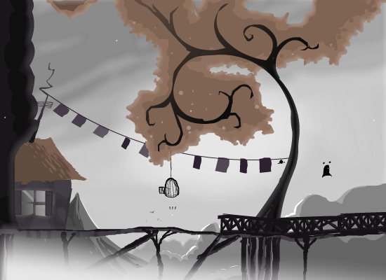


These sceenshots are from a Flash game called Coma and serve as a perfect example of a Flash-made animation that used Photoshop painted backgrounds to give an eerie, serene, and painterly atmosphere. I love the details/shadows added to the grass and trees despite the relatively flat colouring, it all gives the world the characters populate a lot more depth and variety.

This is a piece of concept art I painted digitally on Photoshop to use as a background on my personal website. While I painted the character with myself in mind (hence the hair), I was very much thinking about my Lightning In A Bottle project and ending up using this as a test piece for environmental concept, which is why I've included it here. Despite the stormy skies I really don't want the sky to be grey... The last thing I want is for the girl's world to to seem dull, lifeless and desolate. The background and lightning in general needs to be dark but vivid, I want interesting colours to be used to portray the storm clouds like blues and purples, that way I can make the lightning interesting colours as well like the blue and purple lightning shown in the photos below. I feel this is important because I want the world to be shown as though through the eyes of my character; through the eyes of a child. Children always see the world as a brighter, more interesting place than jaded adults. Their imaginations transform the most mundane surroundings into fantastic playgrounds bursting with colour and magic, everything always seems better when you're young because if the endless possibilites and unexplored potential. That's what I want to convey using the colours of the sky.


Another things I realised while working on my background art was that if I was going to have a blue/purple sky, I would need my character to be coloured in a way that would stand out without clashing horribly. It's essential she doesn't blend into the background, so I'll need to avoid blues and purples for her outfit. Yellows and oranges contrast nicely against the cold sky colours as well as being complimentary (as I discovered with my blonde her in the background concept), so they seem like good starting choices to play with.
No comments:
Post a Comment